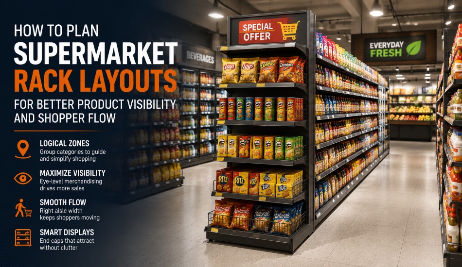
Walk into any well-run supermarket and you will notice something before you notice the products: the layout just works. Shoppers move through the aisles without hesitation, key items catch the eye at the right moments, and nothing feels crowded or confusing. That result is rarely accidental. It comes from a rack layout that has been planned around how people actually shop, not just how much stock needs to fit on the floor.
The way you arrange your supermarket racks affects far more than tidiness. It shapes how long shoppers stay in the store, which products they notice, how easily they find what they came for, and ultimately how much they spend. A poorly planned layout creates bottlenecks, hides high-margin products, and pushes customers to leave faster than they should. A well-planned one guides shoppers naturally past the items you most want them to see.
This guide walks through the practical decisions behind a strong supermarket rack layout, from choosing between wall units and aisle units to setting the right aisle width and using end displays without cluttering the store.
Wall Units vs Aisle Units
Every supermarket layout is built on two basic shelving choices: wall shelving along the perimeter and gondola racks running through the floor.
Wall shelving is fixed to the walls and makes efficient use of vertical space. It is generally more affordable to install, keeps the floor area open, and works well for organizing perimeter stock such as beverages, dairy cases, or bakery displays. Because it runs along a fixed boundary, it also helps frame the shape of the store and gives shoppers a clear sense of where the space begins and ends.
Gondola racks, by contrast, stand freely in the middle of the store. Most are double-sided, meaning products face outward on both sides of the unit. This is what creates the classic supermarket aisle, with shelving on either side and a walkway down the middle. Gondola shelving is the more flexible option. Units can be moved, reconfigured, and adjusted in height without construction work, which makes it easier to update planograms, run seasonal promotions, or respond to changing product mixes.
Most supermarkets use a combination of both. Wall shelving anchors the perimeter, while gondola racks form a grid of aisles in the center of the floor. Larger stores tend to lean more heavily on gondola grids to maximize the amount of product displayed per square meter, while smaller stores often rely more on wall shelving to keep costs down and preserve open floor space.
How to Create Logical Product Zones
Before placing a single rack, decide how the store will be divided into zones. Shoppers do not think in terms of individual products; they think in categories. Grouping related items together, such as breakfast foods, cleaning supplies, or personal care, reduces the mental effort needed to shop and keeps people moving with purpose rather than wandering.
A few principles make zoning more effective:
- Start with high-frequency categories near the entrance. Staples that most shoppers buy, such as fresh produce or bread, are often placed early in the path to draw people into the store and set a positive first impression.
- Place complementary categories next to each other. Positioning items that are often bought together, such as pasta and sauce, or chips and dips, encourages larger basket sizes.
- Keep planned purchases and impulse purchases separate but connected. Necessities pull shoppers through the store, while snacks, drinks, and seasonal items placed along that route capture additional spending.
- Maintain consistency between visits. Once a zoning plan is set, avoid moving major categories too often. Shoppers build a mental map of the store, and constant changes create frustration rather than discovery.
Zoning is essentially the floor plan of your entire store strategy. Everything else, including eye-level placement and end displays, works within the zones you define first.
Eye-Level Merchandising and Sightlines
Shelf height has a direct effect on what shoppers see and buy. On a standard gondola rack, the middle shelves at eye level receive the most attention with the least effort, which is why they are often called the “eye level is buy level” shelves. Lower shelves require shoppers to bend down and typically hold bulkier or heavier items such as large packs or bottled goods. Upper shelves require reaching and are better suited to slower-moving or overstock items.
When planning shelf placement, keep these points in mind:
- Reserve eye-level and just-below-eye-level shelves for your most profitable items, new products, or items you want to promote.
- Place children’s products slightly lower, at a height children can see and reach, if that category is relevant to your store.
- Use shallower shelves near the top for lighter, smaller items and deeper shelves at the base for heavier goods, which also improves stability and safety.
- Avoid overloading shelves to the point where individual products get lost. A shelf that is too full is just as hard to shop as one that is empty.
Sightlines matter just as much as shelf height. Shoppers should be able to see clearly down an aisle and, ideally, catch glimpses of key categories or signage from a distance. Racks that are too tall in the wrong location can block sightlines and make a store feel closed in, while racks that are appropriately scaled help shoppers orient themselves quickly. As a general rule, taller gondola runs work best deeper inside the store where shoppers are already browsing, while lower units near entrances and checkout areas keep the space feeling open and easy to scan.
Aisle Width and Shopper Flow Basics
Aisle width is one of the most overlooked factors in supermarket layout, yet it has a direct impact on comfort, safety, and sales. Aisles that are too narrow cause congestion, make it hard to pass other shoppers or trolleys, and can push people to leave a section before they have finished browsing. Aisles that are unnecessarily wide waste valuable floor space that could otherwise hold product.
A commonly used starting point is around 48 inches (roughly 1.2 meters) for a standard aisle, which allows two shopping trolleys to pass comfortably. Main walkways and accessibility routes generally need to be wider to accommodate wheelchairs, trolleys, and higher foot traffic, while secondary aisles in smaller sections can be slightly narrower without disrupting flow.
Beyond raw measurements, think about the overall traffic pattern of the store:
- Avoid dead ends. Aisles that lead nowhere frustrate shoppers and discourage full-store browsing.
- Create a clear main path. Many supermarkets use a loop or racetrack-style layout, where a wide central aisle guides shoppers past the perimeter of the store before directing them into the interior aisles.
- Keep high-traffic intersections open. Points where multiple aisles meet, such as near the entrance or checkout, should have extra clearance to prevent bottlenecks.
- Test the layout by walking it yourself. Push a trolley through the planned aisles before finalizing the design. Problems that are invisible on paper often become obvious in practice.
Good flow does not mean rushing shoppers through the store. It means removing friction so they can move at their own pace and give their attention to the products, not the layout.
Using End Displays Without Clutter
End caps, the displays at the end of a gondola run, are some of the highest-visibility spots in the entire store. Because they sit at the intersection of two aisles, they catch the eye from multiple directions and are ideal for promotions, seasonal items, or new product launches.
Their visibility is exactly why they need to be used carefully. An end display that is overstuffed or poorly organized undermines its own purpose and can make the surrounding aisle feel cluttered rather than inviting. A few guidelines help keep end caps effective:
- Feature one clear theme per end cap. Mixing too many unrelated products dilutes the message and makes the display harder to read at a glance.
- Rotate displays regularly. Refreshing end caps for new promotions or seasons keeps regular shoppers engaged and gives them a reason to look twice.
- Leave breathing room. A display with clear spacing and visible signage performs better than one packed to the edges.
- Use signage that is readable from a distance. Shoppers often decide whether to stop based on what they can see from several meters away, not up close.
Used well, end displays act as punctuation marks throughout the store, breaking up long aisle runs and giving shoppers natural points to pause, notice something new, and add it to their basket.
Layout Tips for Minimarts vs Larger Supermarkets
Not every store has the same amount of space to work with, and layout strategy should scale accordingly.
For minimarts and smaller supermarkets:
- Rely more heavily on wall shelving around the perimeter to keep the center floor open and reduce the feeling of a cramped space.
- Use two or three gondola runs in the central area rather than a full grid, focused on the highest-turnover categories.
- Choose shorter gondola heights, generally in the 48 to 54 inch range, so sightlines remain open across the whole store and staff can see the entire floor from one position.
- Prioritize flexibility. Smaller stores often need to adjust their category mix more frequently, so modular gondola shelving that can be reconfigured without major disruption is especially valuable.
For larger supermarkets:
- Use a full grid of gondola racks as the primary structure, with wall shelving reserved for supplementary categories along the perimeter, such as chilled or frozen goods.
- Take advantage of taller gondola units, often up to 72 inches, in the deeper sections of the store where shoppers are already engaged and browsing by category.
- Plan for wider main aisles and clear racetrack-style circulation, since larger stores see heavier and more varied foot traffic, including trolleys, baskets, and higher shopper volumes at once.
- Build in more end caps and secondary display points along the extended aisle runs to maintain interest across a larger footprint.
In both cases, the underlying principle is the same. The layout should match the realistic traffic patterns and product range of the store, not a generic template borrowed from a much larger or smaller format.
Bringing the Layout Together
A supermarket rack layout is never just about fitting product on shelves. It is a plan for how customers experience the store from the moment they walk in to the moment they reach the checkout. Getting the wall-to-gondola balance right, zoning categories logically, merchandising at eye level, sizing aisles for comfortable flow, and using end displays with restraint all work together to create a store that feels easy to shop and encourages customers to see more of what you offer.
Getting these details right starts with the shelving system itself. A durable, adjustable gondola rack gives you the flexibility to build the layout your store actually needs, and to change it as your product range and customer flow evolve.
Explore our full range of gondola rack solutions and find the right configuration for your supermarket or minimart layout.